Finding Your Edge In The Market Part Three

Finding Your Edge In The Market Part Three

As we have discussed before, finding your edge in the market is a major key to becoming a professional trader. Your edge in the market is not one particular thing, but more so a combination of factors. It may be your technical strategy that yields statistically positive expectancy over time combined with your money management, psychology, and proprietary tools for analyzing the market. Today, we are going to discuss another factor that holds enormous power to help you further develop and refine your edge in the market: Confluence.

Confluence is literally defined in the dictionary as a coming together of things, a crowd, or a throng. In trading, confluence is a coming together of various factors that determine whether to take a trade. If a trade set-up has strong confluence, that means it has several determining factors, all screaming together for you to take this trade. A trade that lacks confluence may have only 1 factor telling you it’s a good trade. If you begin to move away from trades with weak confluence and only enter trades with strong confluence, you will see a further edge develop in your trading, and you will see your winning percentage continue to increase.

Let’s look at areas of confluence on some charts to get a better visual understanding of this powerful tool.
Looking all Methods
Support and Resistance
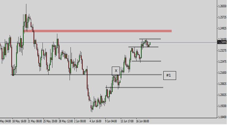
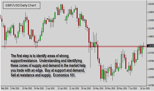
Our first step to finding a trade set-up with strong confluence is to find areas of very clear support and resistance. I like to initially look for these on the Daily Chart and then move down to lower time-frames. Remember it is statistically proven that technical set-ups that occur on higher time-frames are more reliable because they include a wider range of data input. Finding support and resistance on longer time-frames and letting that guide your short-term set-ups is a great way to increase your winning percentage.
Now, we can add any of the various technical indicators to this chart to see if there are any areas of strong confluence.
There is Something to Be Said
Technical Indicators
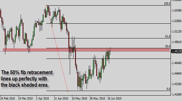
Now, we can see that there is strong confluence at this area where price is currently holding. Not only has former support turned into resistance, but it also lines up perfectly with a major 50% fib retracement. I was actually planning on taking this trade short at the 50% fib level at 1.4871 for over a week. Unfortunately, I live on the East Coast and this trade triggered during the London Open at 3:30 am est while I was asleep. However, for those who did take this short, they would have sat through a max drawdown of only -12 pips and would have been up over 100 pips within a few hours.

***Your capital may be at risk. This material is not investment advice.***

Finding Your Edge in the Market Part Two

Finding Your Edge in the Market Part Two

Stop Buying Supply and Selling Demand!

As we discussed in the last article, understanding the dynamics of supply and demand in the market can bring a revolution to your trading. In this article, we will discuss how to implement this new understanding of supply and demand in order to give you an edge in your trading approach. Remember, in order to consistently make money in the market, you must know what your edge is and be able to define it.

One of the most common traits of losing traders is not understanding this basic idea of supply and demand in the marketplace. Most losing traders are unknowingly buying supply and selling demand. Read that last sentence again.

Trading is a game of probability. When you take a trade, you will never be guaranteed that price is going to move in your direction. However, if you have an edge and have done an adequate amount of analysis and are trading intelligently, you may enter a position knowing that the odds are in your favor that price will move in your direction. Sure, it may move against you and trigger your stop loss, but you know that more often than not, it is going to move in your direction and you are going to get paid.

The primary way to stack the odds in your favor is by selling supply in the market and buying demand. Most struggling traders do not understand how to recognize these areas of supply and demand in the market. Your goal should be to find these zones of supply and demand in the marketplace, and then with your trading strategy, take positions around these areas.

For example, if you have identified a particular area on a chart as an area of supply, then you do not want to be buying in that area. Conversely, if you have identified an area of demand, you don’t want to be selling in that area. If you go with the market flow like this—buying at demand and selling at supply—you will dramatically increase your winning percentage, and as you see this truth work in action, you will develop an increased confidence in your trading ability and in your strategy, which is absolutely essential to being a consistently, profitable trader.
Getting a Hold of Part Two
Market Edge
This chart is a 1 Hour Chart of the EUR/USD. The black shaded areas are areas of supply and demand in the market. You want to learn to identify these areas on your charts. Where has price stalled in the past? This is the question to ask. You want to identify zones on your chart where price has found support or resistance.

The basic mantra of support and resistance trading is that if you have an area of support or demand in the market and price is finally able to break below it, then this area that once acted as demand and support will now act as resistance or supply. Understanding this one simple truth is powerful enough to dramatically increase your winning percentage as a trader. Take a look at the chart at the very long black line numbered, #1. This line acted as support from May 18th through June 3rd. Then finally on June 4th sellers were able to push the market lower. Once a major line of support like this is broken, this area will now acted as resistance the next time price visits this area. The reason is simple.

The reason price was finally able to move below black line #1 was because a massive amount of sellers came into the market. All of those sell orders are camped right at line #1. In the future, when price makes its way back up to this level, it will most likely bounce short again because of all the sell orders camped at this level. The sellers who initially broke through this black line #1, will probably be able to fend off the initial fight to break through this line to the upside in the future.

And sure enough, we can see where price finally came back up to that area on June 11th at the X. The sellers were indeed able to fend off the initial push by buyers. If you had sold at resistance at the black line #1 on June 11th, you would have been able to pocket over 100 pips on the move.

***Your capital may be at risk. This material is not investment advice.***

Finding Your Edge in the Market Part One

Finding Your Edge in the Market Part One

Supply & Demand in the FX Market

The basis of free market economic theory is the truth that supply and demand determine the price of goods and services. For example, if Joe has a new product he wants to sell, how does he determine how much to sell it for? Well, he can do lots of marketing research on his competition and determine what a fair initial price would be, but ultimately his price is going to be determined by the market. If lots of folks are buying his new gizmo, then Joe can raise the price. On the other hand, if no one is buying his gizmo, he can drop the price, in hopes of luring in prospective buyers.

This economic truth dominates free markets and the largest free marketplace in the entire world is the FX Market. What rules the FX Market? How are currency prices set? By supply and demand.
Finding the Edge
When you begin to see currency prices in this light, it really can bring a revolution to your perspective and understanding of the marketplace. Let’s take a look at a chart.

Every time you look at an FX Chart (or any chart for that matter), there is a story being told before your eyes. The two main characters in that story are Supply and Demand. In the above chart, the green areas are zones where demand came into the marketplace and caused buyers to bid up the price for this currency pair, and the red zones are areas where excess supply came into the market and caused buyers to weaken and sellers to push down the price for this currency pair.

At the green box #1, buyers saw the pair as cheap and at a good price, so they bought. Eventually, price rose to the red box #1 and at this point, buyers suddenly started to see the price as too expensive. Here there is all of a sudden too much supply in the market. There is more of this currency pair than there are buyers who want to purchase it, so the excess supply causes sellers to push the price down.

Sellers take control of the market and price is pushed down to green box #2. At this point a gridlock begins to form. Sellers are pushing it lower, but buyers are meeting them head on. Sellers can’t push it any lower, but buyers can’t really push it any higher, either. There is a battle going on between buyers and sellers. Eventually, either buyers or sellers will give up and price will continue in one direction. In this example, buyers are finally able to take control and push the price up to red box #2. At this point, there is once again an excess of supply in the market and sellers push prices all the way down to green box #3.

At red box #3, there is once again a battle between buyers and sellers that ensues for several candlesticks before sellers give up and buyers are able to push prices up to red box #3.

***Your capital may be at risk. This material is not investment advice.***

EuroZone Debt Crisis Explained

EuroZone Debt Crisis Explained

What will happen to the EuroZone Debt Crisis Now?

The EuroZone Debt Crisis Explained: How to Profit From A Further Collapse of the Euro Anyone who hasn’t been living in a cave for the last 6 months is probably aware of the fiscal disaster that has surfaced in Europe. It’s being billed as the Greek Debt Crisis by the media, but intelligent analysts, investors, and traders, understand that it is far beyond Greece. It is the European Debt Crisis. Let me give you a super basic history lesson on the Euro and how we got to where we are today, which is the possible demise of the Euro and the break-up of the EuroZone.

When will this Debt Crisis Situation Get Resolved?

When the EuroZone formed in the late 90’s, Germany and France were the economic powers and every other country was clearly in a subservient position, economically speaking. When countries want to build roads, fund schools, and do various other large-scale projects, they fund this activity by issuing debt in the form of government bonds. Countries that are economic powers are able to borrow this money for pretty cheap. However, countries that are not in excellent financial shape have to pay more to finance their debt by offering investors a higher yield. Is it more expensive to borrow $100 for 1% interest or 2% interest. Of course, 1%.

Economically-weak countries such as Greece, Portugal, Italy, Ireland, and Spain were paying quite a bit to be able to borrow money. By joining the EuroZone, they were magically allowed to borrow money at very close to German bond yields. This means that because Joe is friends with Bob, even though Joe is financially irresponsible, he is able to borrow money cheaply and easily because he is friends with Bob. You get the picture.

So the grand idea when the EuroZone started was that these weak countries like Greece would be able to borrow money at cheap rates in order to economically develop their countries in a responsible manner. This would help them close the gap with stronger countries like Germany and France, and then all of Europe would grow more powerful. But, oh how the idealistic plans of man often fail in reality.

What went wrong you ask? Well, of course Greece, Portugal, Spain, Italy, and Ireland borrowed money. It’s what they did with the money, and how much they borrowed that became a problem. Instead of using the money to develop strong economic infrastructure in their respective countries, they went on reckless spending sprees. Imagine a college freshman with a new credit card and a mall 2 minutes from campus. That may be a bit of a stretch, but you get what I mean.

And so here we are 10 years later. These countries have spent so much money and developed such irresponsible fiscal agendas that they are now having trouble paying back all those loans. To make it worse, investors are now demanding more yield in order to hold the debt of these countries. That is making it even harder for the PIIGS (Portugal, Italy, Ireland, Greece, Spain) to pay back the money they owe. Thus, in the current Age of Bailouts, the EuroZone has come through and promised to loan these countries the money they need.

***Your capital may be at risk. This material is not investment advice.***