Backside Fibs Technique

Backside Fibs Technique

When I started trading years ago, the first system I was introduced to was a very simple strategy that involved Fibonacci. Unfortunately, the Trading system was so simple that it lost money on a consistent basis! But as I continued to evolve and develop from those humble beginnings, I never did stray very far from my Fibs. Along the way, however, I have discovered an alternative use of Fibonacci levels that is incredibly effective. If you currently use Fibs, there is a strong possibility you are only using them at about a 50% rate of efficiency.

Traditional Fib Execution

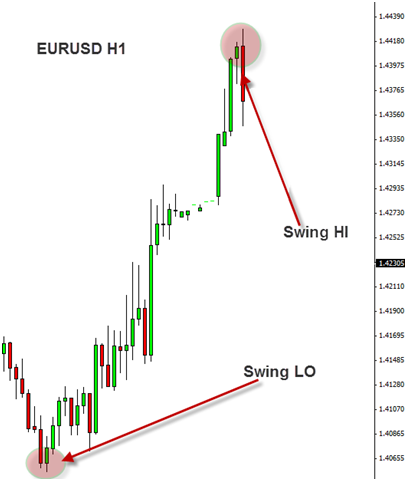
When I first began using Fibs on a consistent basis, I used them the way that most people do. You identify a swing HI and a swing LO on a chart if price is moving down (reverse in a bullish market), then you draw the Fib tool from the HI to the LO, and Fibonacci retracement levels are automatically populated on your chart. The chart directly below depicts a very clear swing HI and swing LO.
Fibs all Day
What to make of the Fibs

Fibonacci Strategy

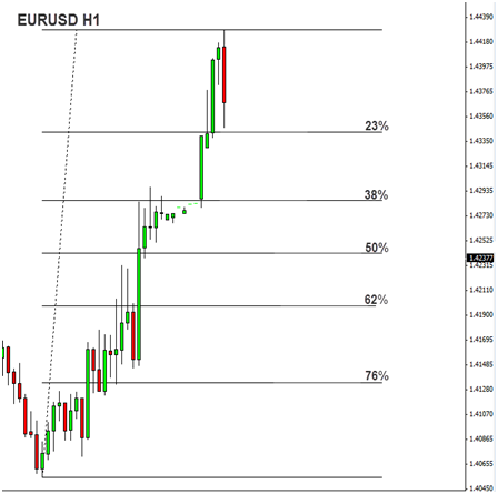
The second step is to simply draw your Fibs from the Swing LO to the Swing HI.

Best Fibonacci Strategy

Once you draw the Fibs from Swing LO to Swing HI, your fib levels automatically populate. Now, Fibonacci trading theory states that when price makes an impulsive move from a Swing LO to a Swing HI, it will typically retrace 23%, 38%, 50%, 62%, or 76% of the move before it breaks the Swing HI and continues the move up. A Fib trader is now looking to enter a long position as price pulls back to one of these Fib levels.

In this example above, simply buying EUR/USD at every Fib level is going to be an ineffective strategy. Most Fib traders will use the Fib levels as guides and then look for additional price action confirmation in order to actually enter a trade. Personally, I like to combine heavy areas of support/resistance with my understanding of order flow in order to identify Fib levels that have a high probability of providing enough support to actually bring substantial demand into the market and push price back to the upside.
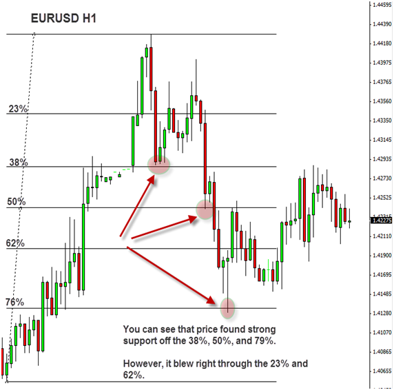
Let’s see how these Fib levels from the chart above actually held up.
What to make of the Fibs

Fibinacci Strategy That Works

As you can see price did bounce nicely off the 38%, 50%, and 76% Fib levels. However, price did not slow down at all at the 23% and the 62%. Long positions off those two Fib levels would have surely been stopped out. Now, a trader can definitely develop an effective trading approach that is centered around buying at Fib retracements in a bullish market or selling at Fib retracements in a bearish market, but I believe that this traditional approach to Fibonacci trading is only partially effective. There is a whole lot more to understand!!

The Backstory

Several years ago, I was talking on the phone with another professional trader who had been very successful in the Forex market. In passing, he mentioned that he loved to trade off the backside of Fibonacci levels. As a Fib enthusiast, this caught my attention. I had never considered trading off the backside of the fibs. Immediately, I went to the charts and began looking at historical price action, and sure enough I began to notice that price was consistently bouncing off the backside of previously broken Fib levels. Today, trading retests of the backside of previously broken Fibonacci levels is one of my favorite price action setups I use to enter positions in the market.

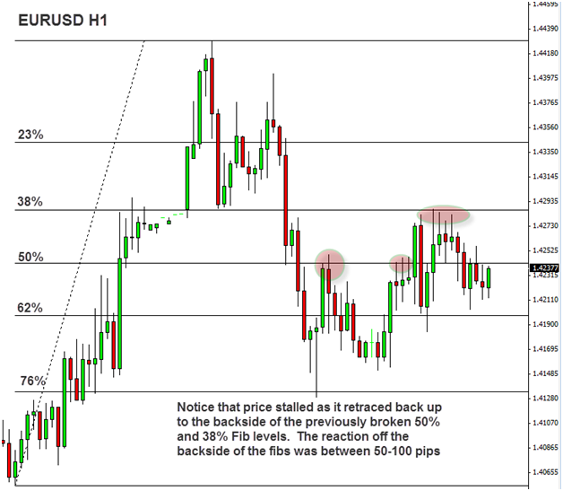
The Backside of the Fibs

Let’s continue with the same EUR/USD example we used in the previous chart pics.
What Makes a Good Trade

Retracement Strategy

Price retraced all the way down to the 76% retracement before it began rising back to the upside. Notice what happened when price rose to the backside of previously broken Fib levels! First, price raced up to the backside of the 62%. Very little resistance was brought into the market and price continued to rise, but notice what happened as it came to the backside of the 50%. Strong resistance resulted in a near 100 pip reversal. Then, when we finally break through the 50% and move up to the backside of the 38%, price finds strong resistance again and reverses nearly 100 pips.

Probability Theory

Forex Trading is a game of probability. You never win every time. Instead, you develop a strategy and risk model that is designed to produce a positive outcome over a large sample of trades. Therefore, it is always a good idea to research your trading ideas in order to develop parameters and filters that help optimize your Forex strategy. During my research phase of this particular setup, I noticed that Stochastics acted as a very effective filter.

Stochastics and Backside of the Fibs
How to Trade Fibs

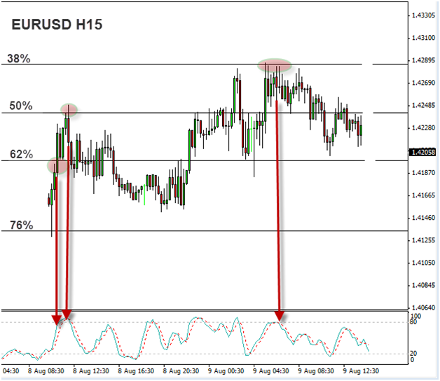
Stochastics Strategy

Now, when I identify a backside of the Fib setup, I go to the 15 Minute chart and look at Stochastics (setting: 8,3 ,3). I prefer for Stochastics to confirm an overbought or oversold condition. In the example above, remember the backside of the 62% did not provide resistance. Price broke straight through it. But notice that Stochastics were still wide open and pointing up. Typically, it is not a great idea to sell when Stochs look like that. If you had waited, in this example, for Stochs to hook and cross, you would not have entered until price broke up to the next Fib level, which was the backside of the 50%. And sure enough, you can see that once Stochs hooked and crossed, and price hit the backside of the 50%, price reversed over 100 pips.

Conclusion By utilizing this new approach to Fibonacci trading, you are essentially increasing your efficiency rating by 50%! Remember to always conduct your own exhaustive testing and research of a trading idea before using it in your own trading, and remember there is always the risk of loss. No trading setup will work 100% of the time.

***Your capital may be at risk. This material is not investment advice.***

Finding Your Edge In The Market Part Four

Finding Your Edge In The Market Part Four

Trading Like the Big Boys

The average retail forex trader has little understanding of what truly drives the FX Market. By discovering what drives the investment decisions of large banking and financial institutions, you can not only further refine your understanding of this marketplace, but you can also begin to place trades, knowing what is driving the market. The birth of this understanding in the mind of a trader will foster a psychological atmosphere of confidence and confidence is one of the most powerful attributes a trader can have. A learned, confident trader will often be a profitable, successful trader.

Interest Rates are the fundamental key driver of the FX Market. Without a doubt, this is what drives every currency pair over the long term. In order to understand this in basic terms, let’s use a hypothetical story. Let’s pretend you are an investor, which you are, and your financial advisor presents you with 2 investment opportunities. In the first opportunity, you are going to receive 5% interest on your money for the year. In the second opportunity, you are going to receive 1.5% interest on your money for the year. Let’s assume the risk on both investments is virtually equal. Which investment opportunity are you going to choose? Of course, you are going to choose the opportunity that yields you 5% interest! Why? Because above all things, what do investors want to do with their money? Make more money!!!

This is why interest rates drive the FX Market. Each currency has an interest rate that its Central Bank sets every 2 months. This benchmark interest rate dictates interest rates throughout the entire economy of that country. For example, when the Federal Reserve (Central Bank of USA) increases its benchmark interest rate, then that decision will have a trickle down effect in the entire economy. Banks will increase interest rates on mortgages, car dealerships will increase interest rates on car loans, etc etc. The reason Central Banks raise and lower interest rates is a topic that is beyond the scope of this article. Instead, we want to know why interest rates drive the market and how we can profit from it as traders.

Large banking and financial institutions will generally invest in currencies that yield higher rates of interest. By tracking what currencies have high interest rates, and which currencies are expected to be raising interest rates, you can determine which currencies will most likely appreciate over the long term. By tracking which currencies have low interest rates, and which currencies are expected to be lowering interest rates, you can determine which currencies will most likely depreciate over the long term. Let’s take a quick look at a chart to see this in action.
Trade Like the Big Boys
Trade like the Big Institutional Traders
This chart depicts the rapid growth of the Aussie Dollar versus the US Dollar over a 7 year period as the Reserve Bank of Australia held rates between 5-7% while the Federal Reserve kept interest rates very low ranging from 1-3%. Investors seeking yield bought the AUD/USD during this time. The move yielded over 5,000 pips.

***Your capital may be at risk. This material is not investment advice.***

Finding Your Edge In The Market Part Three

Finding Your Edge In The Market Part Three

As we have discussed before, finding your edge in the market is a major key to becoming a professional trader. Your edge in the market is not one particular thing, but more so a combination of factors. It may be your technical strategy that yields statistically positive expectancy over time combined with your money management, psychology, and proprietary tools for analyzing the market. Today, we are going to discuss another factor that holds enormous power to help you further develop and refine your edge in the market: Confluence.

Confluence is literally defined in the dictionary as a coming together of things, a crowd, or a throng. In trading, confluence is a coming together of various factors that determine whether to take a trade. If a trade set-up has strong confluence, that means it has several determining factors, all screaming together for you to take this trade. A trade that lacks confluence may have only 1 factor telling you it’s a good trade. If you begin to move away from trades with weak confluence and only enter trades with strong confluence, you will see a further edge develop in your trading, and you will see your winning percentage continue to increase.

Let’s look at areas of confluence on some charts to get a better visual understanding of this powerful tool.
Looking all Methods
Support and Resistance
Our first step to finding a trade set-up with strong confluence is to find areas of very clear support and resistance. I like to initially look for these on the Daily Chart and then move down to lower time-frames. Remember it is statistically proven that technical set-ups that occur on higher time-frames are more reliable because they include a wider range of data input. Finding support and resistance on longer time-frames and letting that guide your short-term set-ups is a great way to increase your winning percentage.
Now, we can add any of the various technical indicators to this chart to see if there are any areas of strong confluence.
There is Something to Be Said
Technical Indicators
Now, we can see that there is strong confluence at this area where price is currently holding. Not only has former support turned into resistance, but it also lines up perfectly with a major 50% fib retracement. I was actually planning on taking this trade short at the 50% fib level at 1.4871 for over a week. Unfortunately, I live on the East Coast and this trade triggered during the London Open at 3:30 am est while I was asleep. However, for those who did take this short, they would have sat through a max drawdown of only -12 pips and would have been up over 100 pips within a few hours.

***Your capital may be at risk. This material is not investment advice.***

Finding Your Edge in the Market Part Two

Finding Your Edge in the Market Part Two

Stop Buying Supply and Selling Demand!

As we discussed in the last article, understanding the dynamics of supply and demand in the market can bring a revolution to your trading. In this article, we will discuss how to implement this new understanding of supply and demand in order to give you an edge in your trading approach. Remember, in order to consistently make money in the market, you must know what your edge is and be able to define it.

One of the most common traits of losing traders is not understanding this basic idea of supply and demand in the marketplace. Most losing traders are unknowingly buying supply and selling demand. Read that last sentence again.

Trading is a game of probability. When you take a trade, you will never be guaranteed that price is going to move in your direction. However, if you have an edge and have done an adequate amount of analysis and are trading intelligently, you may enter a position knowing that the odds are in your favor that price will move in your direction. Sure, it may move against you and trigger your stop loss, but you know that more often than not, it is going to move in your direction and you are going to get paid.

The primary way to stack the odds in your favor is by selling supply in the market and buying demand. Most struggling traders do not understand how to recognize these areas of supply and demand in the market. Your goal should be to find these zones of supply and demand in the marketplace, and then with your trading strategy, take positions around these areas.

For example, if you have identified a particular area on a chart as an area of supply, then you do not want to be buying in that area. Conversely, if you have identified an area of demand, you don’t want to be selling in that area. If you go with the market flow like this—buying at demand and selling at supply—you will dramatically increase your winning percentage, and as you see this truth work in action, you will develop an increased confidence in your trading ability and in your strategy, which is absolutely essential to being a consistently, profitable trader.
Getting a Hold of Part Two
Market Edge
This chart is a 1 Hour Chart of the EUR/USD. The black shaded areas are areas of supply and demand in the market. You want to learn to identify these areas on your charts. Where has price stalled in the past? This is the question to ask. You want to identify zones on your chart where price has found support or resistance.

The basic mantra of support and resistance trading is that if you have an area of support or demand in the market and price is finally able to break below it, then this area that once acted as demand and support will now act as resistance or supply. Understanding this one simple truth is powerful enough to dramatically increase your winning percentage as a trader. Take a look at the chart at the very long black line numbered, #1. This line acted as support from May 18th through June 3rd. Then finally on June 4th sellers were able to push the market lower. Once a major line of support like this is broken, this area will now acted as resistance the next time price visits this area. The reason is simple.

The reason price was finally able to move below black line #1 was because a massive amount of sellers came into the market. All of those sell orders are camped right at line #1. In the future, when price makes its way back up to this level, it will most likely bounce short again because of all the sell orders camped at this level. The sellers who initially broke through this black line #1, will probably be able to fend off the initial fight to break through this line to the upside in the future.

And sure enough, we can see where price finally came back up to that area on June 11th at the X. The sellers were indeed able to fend off the initial push by buyers. If you had sold at resistance at the black line #1 on June 11th, you would have been able to pocket over 100 pips on the move.

***Your capital may be at risk. This material is not investment advice.***

Finding Your Edge in the Market Part One

Finding Your Edge in the Market Part One

Supply & Demand in the FX Market

The basis of free market economic theory is the truth that supply and demand determine the price of goods and services. For example, if Joe has a new product he wants to sell, how does he determine how much to sell it for? Well, he can do lots of marketing research on his competition and determine what a fair initial price would be, but ultimately his price is going to be determined by the market. If lots of folks are buying his new gizmo, then Joe can raise the price. On the other hand, if no one is buying his gizmo, he can drop the price, in hopes of luring in prospective buyers.

This economic truth dominates free markets and the largest free marketplace in the entire world is the FX Market. What rules the FX Market? How are currency prices set? By supply and demand.
Finding the Edge
When you begin to see currency prices in this light, it really can bring a revolution to your perspective and understanding of the marketplace. Let’s take a look at a chart.

Every time you look at an FX Chart (or any chart for that matter), there is a story being told before your eyes. The two main characters in that story are Supply and Demand. In the above chart, the green areas are zones where demand came into the marketplace and caused buyers to bid up the price for this currency pair, and the red zones are areas where excess supply came into the market and caused buyers to weaken and sellers to push down the price for this currency pair.

At the green box #1, buyers saw the pair as cheap and at a good price, so they bought. Eventually, price rose to the red box #1 and at this point, buyers suddenly started to see the price as too expensive. Here there is all of a sudden too much supply in the market. There is more of this currency pair than there are buyers who want to purchase it, so the excess supply causes sellers to push the price down.

Sellers take control of the market and price is pushed down to green box #2. At this point a gridlock begins to form. Sellers are pushing it lower, but buyers are meeting them head on. Sellers can’t push it any lower, but buyers can’t really push it any higher, either. There is a battle going on between buyers and sellers. Eventually, either buyers or sellers will give up and price will continue in one direction. In this example, buyers are finally able to take control and push the price up to red box #2. At this point, there is once again an excess of supply in the market and sellers push prices all the way down to green box #3.

At red box #3, there is once again a battle between buyers and sellers that ensues for several candlesticks before sellers give up and buyers are able to push prices up to red box #3.

***Your capital may be at risk. This material is not investment advice.***